Taking the first steps in visualising data can be overwhelming. To help you out we are creating step-by-step examples of how to use some of the tools reviewed on DrawingByNumbers.org.
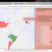
OpenHeatMap is the first up. We have put together an presentation of the steps we took to plot data collected through the Sex Workers Voices Project on a map of West Bengal. The OpenHeatMap workthrough shows how we first sorted the data in order to visualise a specific type of violence – verbal abuse – committed by a specific perpetrator – local hooligans – against women sex workers. We then tracked down location data for all 48 survey sites (a tricky task!) and arranged it according to OpenHeatMap's requirements. This data was finally inputted into the web application and a heat map created. You can download the data and follow along yourself. Please drop us a line and tell us what you think on drawingbynumbers [at] tacticaltech.org.
Read more about the Sex Workers Voices project, here.

")